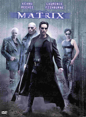
The Matrix (1999, Wachowski Brothers)
 The poster is dark tinted with grey, this makes it look gloomy and mysterious. The semitransparent numbers down the sides of the image add to this mystery and hints at science fiction themes. All of the characters are holding guns, a commonly used prop in Thriller films. Neo is not only at the front of the group but also has the biggest gun showing that he is the main and the most dangerous character.
The font resembles corrupted computer text which again relates to the narrative conveys disruption to the viewer.
The black costumes show how serious the characters are and their lack of fussy items of clothing show that they are ready for action. Trinity's outfit in particular is used to draw a male audience through sex appeal because of it's tight nature.
The sunglasses, another commonly used item of Thriller film costume, dehumanize the characters making them appear emotionless and imposing.
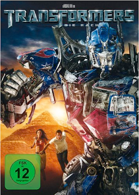
Transformers: Revenge of the Fallen (2009, Michael Bay)
 The background is dark but with the sun rising, which shows a dark mood but good wins over evil. The main human actors are smaller than Optimus Prime (the Transformer) showing that he is the main appeal of the film and to attract Transformers' already established fan base. Optimus Primes' stance and position in front of the humans and a symbol of human civilization ( the Pyramid) shows that he is defending them from danger. This connotes to the audience that action and danger is a large part of the plot. This is enforced by the damage already shown on Optimus Primes' exterior. Once again sex appeal is used to draw in male audiences through Megan Fox's revealing outfit. Shia LaBoef is used to draw in teenage female audiences as admired by lots of girls of that age range. He is also attracting younger male audiences who want to be like him.
The text is an updated version of the 1984 Transformers TV series logo. Using a tarnished metal effect on the title makes it look battle scarred, which matches the age of the franchise and Optimus Primes' condition.
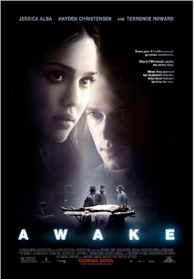
Awake ( 2007, Joby Harold)
 The poster is largely black with a shaft of light connoting death and unconsciousness. The main characters' faces take up most of the space showing that the film is being sold on the back of the actors. The colours of the actors' faces are muted as if the scene is a memory however the colours of the operating theater are more vibrant and the image clearer showing that it is the reality. The large picture of the main character's face is half in shadow showing that he is in a different state from his female counterpart. The operating theater is in the center of the image which conveys that the plot is centered around surgery.
The poster features a small segment of text about 1 in 700 people being awake during surgery, this is used to unnerve the audience and make the film seem like it could actually happen.
The text is sans-serif capitals of glowing white which relates back to the themes of death and "The light at the end of the tunnel".
The surgeons in the operation scene are all turned towards each other as if they are conspiring which adds mystery as the audience wishes to know what they are plotting.
No comments:
Post a Comment