
Showing posts with label Jennie. Show all posts
Showing posts with label Jennie. Show all posts
Friday, 26 March 2010
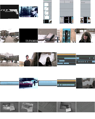
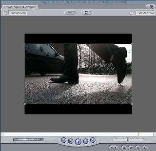
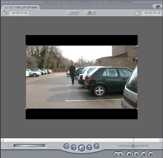
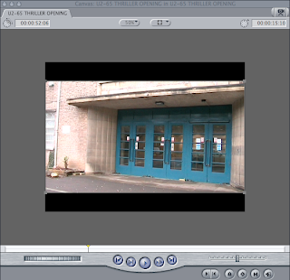
Screen Shots for Evaluation
Here are some of the screen shots that we took to include in our evaluations.
Tuesday, 23 March 2010
Friday, 12 March 2010
Feedback
After showing our project to the class we received the following comments.
- The use of props worked well such as the photograph shots
- Changing the colour on the clips helped it make sense and looked good
- Our main protagonist was clear
- The locations were well chosen as they didn't look like we filmed in college
- Lots of different shot types and angles. One particular shot that worked well was the over the shoulder shot of the agent at his desk.
- The ident matched the genre well
- In order to improve our project we shall have to add sound and make sure the low angle shot of the agent remains clear for it's duration
Thursday, 11 March 2010
Target Audience
Our target audience is 17-30 year old males. Their viewing preferences would be action, thriller and political films. Because of the political theme in our film it will attract an older audience as opposed to young teenagers. Examples of similar films that attract this audience are; Se7en (1995, David Fincher), Identity (2003, James Mangold) and Children of Men (2006, Alfonso Cuarón).
Dark aspects of the film such as murder may also attract fans of crime the horror genre.
Dark aspects of the film such as murder may also attract fans of crime the horror genre.
Rough cut deadline
As today is the rough cut deadline, we've had to make credits for our film and do as much editing as we could with the 1hr 10mins of the lesson. We have finished editing all of the film clip itself, and started adding more to our soundtrack. This involved ambient as well as non-diegetic sound. The film at the moment is 2minutes, 10seconds, with the editing.
Tuesday, 9 March 2010
Friday, 5 March 2010
Targets
Today we were given the following targets for our film:
- Add an earlier shot of the clock to give meaning to the audience
- Begin garage-band soundtrack today
Today's Filming and Editing
Today we filmed the extreme close ups of the evidence photographs and incorporated them into our project. Following our targets we then added some more footage of the clock showing a different time to show the passage of time. We then moved on to Garage Band in order to create a sound track for our Thriller opening. We wanted to create a sinister atmosphere through non-diagetic sound.
Thursday, 4 March 2010
Evaluation Questions
The following questions must be answered in your evaluation PowerPoint:
1. In what ways does your media product use, develop or challenge forms and conventions of real media products?
2. How does your media product represent particular social groups?
3. What kind of media institution might distribute your media product and why?
4. Who would be the audience for your media product?
5. How did you attract/address your audience?
6. What have you learnt about technologies from the process of constructing the product?
7. Looking back to your preliminary task, what do you feel that you have learnt in the progression from it to the full product?
1st lesson only editing
We are keeping the flashbacks blue, and are making the contrast/brightness high to separate it from the rest of the 'present day' footage, and make it obviously different. the rest of the film, not the flashbacks, was left as it was when we filmed it. We will/ have used dip-to-colour fades and a lengthened fade, along with cuts and animating the ident.
Tuesday, 2 March 2010
Props and Costume
Here are the props that we used:


A criminal reference file that we mocked up

 3 Other documents of random text to bulk out the file. These had coffee stains on in order to make the scene look more seedy and to show that the agent doesn't care about being neat
A clock

A coffee mug

A folder

2 grey-scale evidence photographs that Jennie took in her kitchen and edited using Adobe Photoshop
We chose to make them grey-scale so that they fitted in with the dark, cold lighting and tint that we used on our footage. Using black and white also connotes that the images were taken a long time in the past and that they are from the criminal's earlier crimes. This hints that the criminal has since moved on to more dangerous criminal activity. For the second photograph Jennie used ketchup as blood. In black and white it is less obviously ketchup and it becomes easier for the audience to suspend their disbelief.
Finished photographs with post it notes


Unfortunately the photos printed out a bit blue but our present day footage has a grey tint so that is almost monotone so the blue wont be noticeable.
A Suit

A Suit

3rd day of filming
Today we managed to get nearly all of the required filming done, with only the extreme close ups left to film. We also started editing the filming we had done.
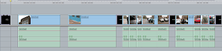
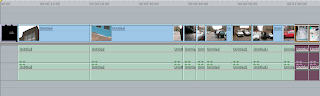
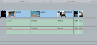
Our Time Line so Far


Friday, 26 February 2010
Credits
Today we also started to add the opening credits top our thriller opening. We have left a gap so that we can add the title and ident of our film later. We have not added any transitions as yet; we shall add them when we have all our footage captured and in the correct order.
Our Story Board With Credits

2nd day of filming
Today we managed to film all of the outside scenes, next lesson we should be moving on to the scenes that need to be filmed inside. We managed to film without any problems, because we had all of the props needed for today. We also managed to edit what we did because all of the shots so far are flashbacks, which we've tinted and raised the contrast. We had to change the filter settings slightly because it is darker today than it was yesterday.

Our Time Line So Far
Stills of Today's Shots


Our Time Line So Far

Thursday, 25 February 2010
Editing the Flashback Footage
We decided that we wanted to make the flashback clips stylized to make the fact they are set at a different time more obvious to the audience. In the end we chose to make them high contrast, mid brightness and tinted blue. This is how they turned out.


The Video Filters We Used

1st Day of Filming
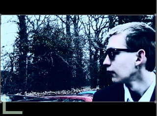
Today we filmed 2 minutes of footage; when we cut the outtakes we had 1 minute of footage left. We did not have the sunglasses necessary to film the agent from the front . This meant that we only got the outside shots from behind Andrew, without sunglasses. Next time we film, we should have all of the props for filming. We didn't encounter any large problems however the tripod would not move as smoothly as we would have liked for the pan shots. We also managed to get shots to incorporate into our storyboard to make it flow more easily. We managed to get all of the shots we could, with the props we had.
Stills of Today's Footage


Time Line

Tuesday, 23 February 2010
Call Sheet
We will film On 25th February, 2nd lesson (10:50 - 12:10)
Jennie shall pick up and bring back the camera.
We are going to film in the college car park. We chose this location because it is inside the college grounds and suits our needs. As we will already be in college we shall not have to organize travel. It is not a public location so we will not have to ask permission from an outside party. Health and safety wise we shall have to watch out for cars when filming and make sure we don't damage any cars.
We will be filming during the day so we will not have to supply lighting.
Apart from the three members of our group we don't need anyone else to be there. Andrew shall be playing our agent and has no lines so will not have to learn a script.
Ben and Jennie shall share the directing and filming equally.
Props:
Andrew shall bring a suit
Ben shall bring some sunglasses
Jennie shall bring some official looking documents, evidence photographs and post-it-notes.
If weather interrupts our filming we shall film the indoor scenes.
In this filming slot we shall try and film all of the car park scene.
We shall capture the long and close up shots of the agent in the car park. We shall not have to re-record any sound for this as we shall only be using non-diagetic music.
Friday, 12 February 2010
Thriller Poster Analysis
Here we have analyzed some Thriller film posters to gain inspiration for ours and to see how they are marketed to their target audience.
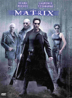 The poster is dark tinted with grey, this makes it look gloomy and mysterious. The semitransparent numbers down the sides of the image add to this mystery and hints at science fiction themes. All of the characters are holding guns, a commonly used prop in Thriller films. Neo is not only at the front of the group but also has the biggest gun showing that he is the main and the most dangerous character.
The font resembles corrupted computer text which again relates to the narrative conveys disruption to the viewer.
The black costumes show how serious the characters are and their lack of fussy items of clothing show that they are ready for action. Trinity's outfit in particular is used to draw a male audience through sex appeal because of it's tight nature.
The sunglasses, another commonly used item of Thriller film costume, dehumanize the characters making them appear emotionless and imposing.
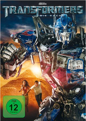 The background is dark but with the sun rising, which shows a dark mood but good wins over evil. The main human actors are smaller than Optimus Prime (the Transformer) showing that he is the main appeal of the film and to attract Transformers' already established fan base. Optimus Primes' stance and position in front of the humans and a symbol of human civilization ( the Pyramid) shows that he is defending them from danger. This connotes to the audience that action and danger is a large part of the plot. This is enforced by the damage already shown on Optimus Primes' exterior. Once again sex appeal is used to draw in male audiences through Megan Fox's revealing outfit. Shia LaBoef is used to draw in teenage female audiences as admired by lots of girls of that age range. He is also attracting younger male audiences who want to be like him.
The text is an updated version of the 1984 Transformers TV series logo. Using a tarnished metal effect on the title makes it look battle scarred, which matches the age of the franchise and Optimus Primes' condition.
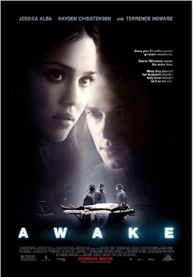 The poster is largely black with a shaft of light connoting death and unconsciousness. The main characters' faces take up most of the space showing that the film is being sold on the back of the actors. The colours of the actors' faces are muted as if the scene is a memory however the colours of the operating theater are more vibrant and the image clearer showing that it is the reality. The large picture of the main character's face is half in shadow showing that he is in a different state from his female counterpart. The operating theater is in the center of the image which conveys that the plot is centered around surgery.
The poster features a small segment of text about 1 in 700 people being awake during surgery, this is used to unnerve the audience and make the film seem like it could actually happen.
The text is sans-serif capitals of glowing white which relates back to the themes of death and "The light at the end of the tunnel".
The surgeons in the operation scene are all turned towards each other as if they are conspiring which adds mystery as the audience wishes to know what they are plotting.
The Matrix (1999, Wachowski Brothers)
 The poster is dark tinted with grey, this makes it look gloomy and mysterious. The semitransparent numbers down the sides of the image add to this mystery and hints at science fiction themes. All of the characters are holding guns, a commonly used prop in Thriller films. Neo is not only at the front of the group but also has the biggest gun showing that he is the main and the most dangerous character.
The font resembles corrupted computer text which again relates to the narrative conveys disruption to the viewer.
The black costumes show how serious the characters are and their lack of fussy items of clothing show that they are ready for action. Trinity's outfit in particular is used to draw a male audience through sex appeal because of it's tight nature.
The sunglasses, another commonly used item of Thriller film costume, dehumanize the characters making them appear emotionless and imposing.
Transformers: Revenge of the Fallen (2009, Michael Bay)
 The background is dark but with the sun rising, which shows a dark mood but good wins over evil. The main human actors are smaller than Optimus Prime (the Transformer) showing that he is the main appeal of the film and to attract Transformers' already established fan base. Optimus Primes' stance and position in front of the humans and a symbol of human civilization ( the Pyramid) shows that he is defending them from danger. This connotes to the audience that action and danger is a large part of the plot. This is enforced by the damage already shown on Optimus Primes' exterior. Once again sex appeal is used to draw in male audiences through Megan Fox's revealing outfit. Shia LaBoef is used to draw in teenage female audiences as admired by lots of girls of that age range. He is also attracting younger male audiences who want to be like him.
The text is an updated version of the 1984 Transformers TV series logo. Using a tarnished metal effect on the title makes it look battle scarred, which matches the age of the franchise and Optimus Primes' condition.
Awake ( 2007, Joby Harold)
 The poster is largely black with a shaft of light connoting death and unconsciousness. The main characters' faces take up most of the space showing that the film is being sold on the back of the actors. The colours of the actors' faces are muted as if the scene is a memory however the colours of the operating theater are more vibrant and the image clearer showing that it is the reality. The large picture of the main character's face is half in shadow showing that he is in a different state from his female counterpart. The operating theater is in the center of the image which conveys that the plot is centered around surgery.
The poster features a small segment of text about 1 in 700 people being awake during surgery, this is used to unnerve the audience and make the film seem like it could actually happen.
The text is sans-serif capitals of glowing white which relates back to the themes of death and "The light at the end of the tunnel".
The surgeons in the operation scene are all turned towards each other as if they are conspiring which adds mystery as the audience wishes to know what they are plotting.
Our Chosen Font
We decided to use the font "Traveling Typewriter".

We chose it because it relates to the typed pages in our mise-en-scene. The font is serif but not ostentatious which matches our main character's formal but plain costume.

We chose it because it relates to the typed pages in our mise-en-scene. The font is serif but not ostentatious which matches our main character's formal but plain costume.
Subscribe to:
Posts (Atom)